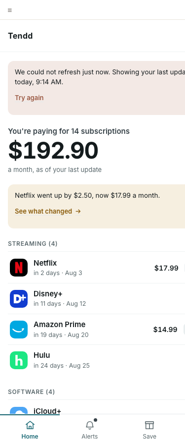
Home / Subscription ListColoured
Screens in color
Every Tendd screen in the Petrol and Paper language. What is coloured here is the sample, not the product: seven screens, five chosen because together they carry every level of the kit and the heaviest layouts, a sixth added at step 6 because the strategy check found the first five never showed the moment the whole product is a bet on, and a seventh, the account screen, added last as the saturation test. The rest stay grey on purpose and are coloured in one pass later, once the system has been proved on these. Open a screen to see its states.
coloured assembled from the kit, with states
grey, waiting still the wireframe, coloured at the rollout
Nothing on a coloured page carries a style of its own: every one is assembled from the design system, and a fix goes into the system rather than onto a screen.
These pages moved house on 2026-08-12, and the move was proved rather than announced. Each one used to load design/kit/kit.css, a single flat sheet; each one now loads design/system/index.css, which is two levels of tokens and a file per component, and kit.css is deleted. A refactor that promises "the look did not change" is worth nothing without an instrument, so all 28 pages were fingerprinted at 360 and 1280 before and after: 3588 elements, 30 computed properties each, paired by document order because every class name moved. The differences collapse to 83 shapes, and every one is explained by a row in one of the four named lists in design/kit/docs/tokens-audit.md. Zero unexplained. The stage was allowed to change the look three times, and 4074 of the moves are the two scales the founder adopted: 21 type sizes onto eight steps, 27 spacings onto an 8px grid, nearest step and ties to the larger, applied mechanically rather than value by value.
The product got a mark on 2026-08-12, and it is the first thing in this system that came from a decision rather than from the wireframes. The founder chose Crop out of thirteen live directions: one letterform drawn larger than any frame that will hold it, and a window cut out of it. Two atoms entered the system, the mark and the word, and the app bar gave up three paint properties it should never have had. The wordmark reversed its tracking with it, from 700 at +0.02em to 800 at -0.02em: the old value was right for a product with no mark in it, where the word carried the identity alone. Measured across the same 28 screens at both viewports: 3774 elements matched, 168 added, 0 dropped, 69 moved, and all 69 are the brand's own slot and the two plan chips whose auto margin absorbs its width. The repository also stops having no icon at all: the favicon and the touch icon are cut from the same geometry and reach 185 pages, every page outside the frozen grey. Recounted 2026-08-20 and it said 132, which was true on 2026-08-12 and has not been true since: the kit, the account pages and the three screens added that day all carry the same two links, and nothing recounted them. Counted by matching rel="icon" across every html file outside wireframes/, .git and docs-course; the single file without it is kit/screens/width10-harness.html, which is an instrument and not a page.
The panel on every screen now carries a theme switch. The dark theme is not a feature decision, it is the proof that the semantic level is real: a rebrand would have worked on the flat sheet too, and only a theme inverts the ground while leaving the action an action. It was stress-tested across all 92 pages of the project in both themes, and not one file in design/system/ had to be edited for it.
Core
Onboarding and Activation
Welcome / Value IntroColoured
Node 1.1, the only PUBLIC surface this product has, and the screen that closes the rollout at 23 of 23. Six organisms were built for it and nothing else: 48 of the 57 components at the rollout already answered to .landing, and the sixth is the landing story, one pinned stage in which the fourteen merchants of the example gather into the product's own list and three of them are cancelled while the total steps 192.90 down to 144.92. It carries no .total - the biggest thing here is the promise, because the number a person owns does not exist yet
Activation Path ChoiceColoured
Node 1.2, the fork the product turns on. D2 puts manual entry beside the bank as an equal second path, so the two doors are one grid rather than a button with a link under it
Connect BankColoured
Node 1.3, the bank path, and the first flow of the rollout at stage 12. Nothing was added to design/system/ to build it
Add SubscriptionColoured
The manual path (D2), and the screen that brings the form primitives into the sample
Guided RevealColoured
The screen the riskiest assumption is tested on. It joined the sample at step 6, when the strategy check found the five chosen for component coverage had left H0 with no coloured screen
Stay Ahead
Alerts / ActivityColoured
The eighth screen, and the first built after the sample closed. It is the self-sufficiency test of the design system at stage 09: assembled from the system with nothing added to it, and it carried the largest hole in the sample, the alert item, which no coloured page had ever rendered
Cut and Celebrate
Cancel GuideColoured
Node 4.9. J3 made into a screen, and D3 keeps the paywall off this moment by name
Cancel Win MomentGrey, waiting
Grey in wireframes
Share SnapshotColoured
Node 4.11, LATER scope. The rollout colours the product rather than the release, and this card is the one thing that leaves the product
Depth (Pro)
History and TrendsColoured
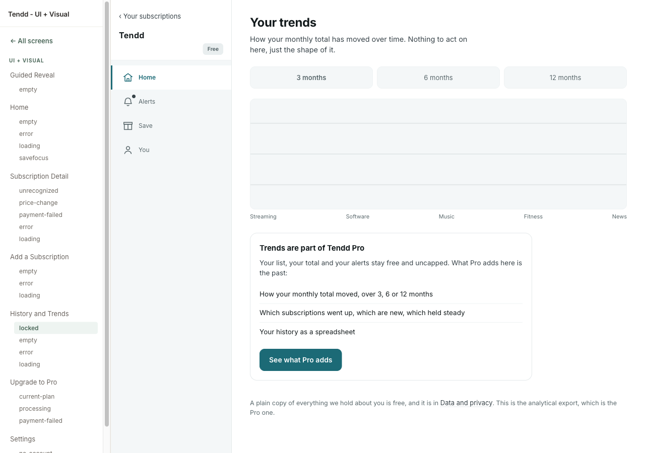
Rebuilt 2026-08-19 on the founder's decision, and it is the only screen since the rollout to change structure. It takes Home's width and Home's head; the range control is real and switches the picture, the sentence and the trend list over 3, 6 and 12 months; What moved and By category sit side by side; and By category is five bars instead of one line. The Pro gate followed it - the two months a free plan draws, with the lock beside them rather than under them. Ground in docs/decisions.md, the twelve monthly totals in docs/bank-connection.md section 6
Upgrade / Tendd ProColoured
The paywall, and the one place the product asks for money
Account and Trust
Connections / AccountsColoured
Node 6.14, where every source of every figure is named. It is design principle 4 turned into a screen
Data and PrivacyColoured
Node 6.15, the screen E3 lives on, in falsifiable sentences rather than a policy
Settings / ProfileColoured
The account screen, and the saturation test. It was built after the sample was already closed and needed nothing new in the kit: every class it uses was read out of the wireframes at step 2, when the inventory was taken from the whole product rather than from the coloured sample
Sign InColoured
Node 1.6, a link and not a password: nothing to remember and nothing to leak
Which plan you are looking at
One product, not two. Founder's decision, 2026-08-20, after walking the coloured screens: "есть такое ощущение непонятки где Free а где Pro". There is no Pro twin of Home, Alerts or Settings and there will not be, because under D3 the paywall sits at depth and most of this product therefore does not know which plan you are on - which is the calm, rather than a gap in it. A screen states the boundary at the point a person meets it, in one shape: what stays free, what Pro adds, a way to see it, and a way past it. Everywhere else the plan chip in the app bar is the whole of the difference. Recounted by design/kit/screens/plans13.cjs, which is the instrument that keeps this sentence true.
Emma is on Free on 15 pages and on Pro on 6, identically in both corpora. The six are the open trend view with its three states, the plan screen of somebody who already pays, and - since 2026-08-20 - the renewal that failed on an account still inside its grace period. The other 36 pages carry no chip at all: the onboarding chain, the landing and the flow screens, where there is no account yet to have a plan. The boundary is named in the screen itself on 17 pages, in 43 places. Recounted 2026-08-21 with the corpus at 57 grey and 57 coloured; it was 16 and 41 when both were 55.
| Where | What the plan changes | What Free gets there | How it is said |
|---|---|---|---|
| Trends | The depth of the history: 2 months against 3, 6 and 12, plus the trend list and the analytical export | A real readout and a real chart of this month against last, not an empty frame | The gate is the screen. It lists what stays free before it lists what Pro adds, and the way past it is the tab bar |
| Alerts | Two alert types: a trial ending, an unusual charge | Price changes and failed payments, uncapped | The two Pro alerts are shown, not hidden, each with a chip and "See what Pro adds". A row in a list, so the list goes on past it |
| Subscription detail | Longer history on the one subscription you are looking at | The whole detail, every state of it | One line under the detail with "See what Pro adds" and "Maybe later" beside it. Four states carry it |
| Cancel guide | Screenshots per step and a direct link that skips the retention screens | Every step, in full, and the primary action | "The steps above are free and always will be." The offer comes after the free path, never in front of it - D3 puts no paywall at the cancel moment |
| Data and privacy | The analytical export | A plain copy of everything held about you (D-Export) | One sentence naming both, so the free one is not hidden behind the paid one |
| Settings | The plan row itself | Unlimited subscriptions and unlimited bank connections (D-Free) | "Your plan / Free" as a group head, with Manage plan. An account control, not a sell |
| Upgrade | The transaction | - | The screen whose subject IS the plan. Five pages: the offer, the processing wait, a first payment that failed, the plan screen of somebody already on Pro, and the RENEWAL that failed on that same account - the one place in the product where a person can lose depth they already had, and where the screen therefore names what Free keeps before it names what pauses |
The two crossings, and one of them was broken until 2026-08-20. Free to Pro runs gate to Upgrade to the wait to the open view. That last step did not exist: the wait carried the sentence "when it is done you go straight back to Your trends, open" and no outgoing link at all, so the only crossing in the product dead ended at the moment it promised delivery. Coming back the other way, the four other tabs of the open view lead to Home, Alerts, Save and You - the same screens a free person sees, because they are the same screens. That is the decision working, not a seam in it.
Was to became
Critique ran on three instruments and the audit on four, all in one pass over the sample. Every finding was re-read in the current file before anything was touched; what did not hold stayed in the log marked dropped at verification, with the reason. Closed, by class.
| Class | Found | Fixed | Dropped at verification | Carried, and why |
|---|---|---|---|---|
| Style past the kit | 0 | 0 | 0 | All 28 pages carry no page-level style block, no style attribute and no class the kit does not define. Checked mechanically, not by eye |
| A measure that stops holding at one width | 3 | 3 | 0 | Found by the seventh screen, on two the stage had already accepted. The three reading measures were written .app .form-col, which ties at 0-2-0 with a blanket reset in the 900 block and loses on source order. The form ran at 588 instead of 560, the Pro gate at 748 instead of 560, the settings column at 733 instead of 620. Bound through > .screen >; no value changed |
| Contextual override (an unnamed variant) | 4 | 4 | 0 | The worst was a second button hiding inside .secondary a, byte-identical to .btn.compact three lines under a comment saying it was not a second button |
| Duplicate under another name | 3 | 3 | 0 | .num was .k, .tone was .context, .rstep .lbl became the declared .lbl.strong |
| Orphan in the kit | 3 | 2 | 1 | .tone-info and --c-bg removed. Dropped: --success is a documented palette token (DESIGN.md calls it Moss) whose consumer is the cancel-win screen, still grey |
| One voice, one zone | 2 | 1 | 0 | Twelve petrol ticks on the paywall were decoration and went quiet. Carried: two filled petrol buttons 55px apart on the form screen, because the class comes from the frozen grey |
| Typography bound to a tag | 2 | 2 | 0 | The group head was written as h2.group-head and broke twice, at 24px browser default against 12px everywhere. Now matched to the class at any heading level |
| Target size | 14 | 13 | 0 | The 44px floor was on the wrong half. It deformed links inside sentences (a four-line paragraph measured 100px instead of 75) and was missing from thirteen that are not in sentences, including "Try again" and "Remove from your list". Carried: one paragraph whose only content is its link, which CSS cannot tell from a sentence |
| Breaks at 360 | 0 | 0 | 4 | Measured on all 28 pages at a true 360 (a default headless browser leaves a scrollbar and measures 345). Zero horizontal overflow, zero clipped or overlapping text, nothing escaping the stage. Dropped: four suspected overflows were the scrollbar |
| Text contrast | 0 | 0 | 0 | Every product text pair passes AA, the switch rows and the account promises included. The tightest is clay on its own wash at 4.57:1 |
| Non-text contrast | 7 | 7 | 0 | Carried to a decision, then decided. A control boundary was --line on white, 1.23:1 against the 3:1 WCAG 1.4.11 asks. The founder's call on 2026-08-11 was to scope the darker edge to controls only: --line-control #7b8d91 on the field, the select, the outline button, the preset tile, the door and the segment (3.46 on paper, 3.10 on canvas), while every card, panel and divider keeps the hairline. Two new values, no existing value moved. Raising --line itself was rejected: it satisfies any checker and outlines the whole product, and the language was chosen against exactly that |
| Motion without a guard | 1 | 1 | 0 | The reduced-motion guard lost the cascade by one class and did nothing: every skeleton pulsed forever for a person who had asked for no motion. It read as correct in the file |
| Decorative glyph in an accessible name | 5 | 5 | 0 | Arrows and ticks injected by content: were being read aloud. Twelve feature rows on the paywall each announced a tick first |
| Review chrome on top of the product | 3 | 3 | 0 | The Home destination was laid out underneath the review panel and showed a 4px sliver; the off-canvas panel kept sixteen links in the tab order on a phone; two chrome colours were under AA |
| Structural desync with the grey | 12 | 12 | 0 | Eleven page titles had been rewritten rather than suffixed. The body text of all 28 pages is character-identical to its grey original |
| Placeholder shipped into colour | 5 | 5 | 0 | [ ? ] and four [chart: ...] notes. This row read 3 and 3 until 2026-08-12 and it was wrong twice over: the count was 5, and stage 07 fixed 3 of them, leaving history-trends-loading and history-trends-empty rendering their bracketed strings into the coloured product for a month. Step 6 drew both, with the Pro gate's own markup and no new component: three gridlines, no path, the box unmoved to the hundredth of a pixel. A row that says 0 carried is the one nobody re-reads |
| Copy against microcopy.md | 13 | 14 | 0 | All thirteen were stage 05 misses, not copying errors: the visible text of every coloured page matches its grey original exactly, so the divergence was between the grey and the line inventory. Closed on 2026-08-11 as Round 4 of the voice rewrite log, which is the mechanism for exactly this: Voice reopens, the grey changes first, the coloured copies follow. Fourteen rather than thirteen, because the open-question leak turned out to be on the welcome landing too, and the landing is not in the coloured sample |
| ARIA and form semantics | 11 | 0 | 0 | Carried by rule. A coloured copy owns the visual layer only, and every one of these is markup: a fieldset with no legend, an aria-label on a paragraph that ARIA discards, section labels repeating their own heading, a form with no required or invalid state. Inventing an ARIA difference between grey and colour is the exact desync this stage tests for |
Where the fixes went: 31 into the kit, 0 onto a screen. That is the number this stage exists to produce, and it is the one worth reading twice. Every style correction landed in design/kit/kit.css and reached 28 pages by itself. That file no longer exists: step 6 of the next stage split it into design/system/ and deleted it, and the sentence is kept in the past tense because where a value came from is the thing this project is most careful about. The edits that did touch a page were not styles: eleven restored titles, one drawn mark, two drawn plots, and the links repointed at coloured screens as they appeared.
The seventh screen, and what a screen that adds nothing proves
The account screen was built after the sample was closed, and it needed nothing new in the kit: not a class, not a value, not a plate in the showcase. That is the saturation signal the stage asks for, and it is only available because the inventory at step 2 was read from every grey page rather than from the screens that were going to be coloured. A kit sized to the sample would have met this screen with four missing components.
It did not arrive empty-handed, though. Assembling it surfaced a defect no page in the sample could show: a reading measure that holds at one width and quietly stops holding at the next. The form column, the Pro gate and the settings column were all declared at a fixed measure and all three lost it past a 900px container, on a rule written for a different screen's layout. Two of those screens had already been walked and accepted. A screen is accepted at every width or it is not accepted, and the width where a defect lives is not always the narrow one.
The thirteen copy findings, and how they were closed
None of these was a colouring error. The visible text of all 28 coloured pages is character-identical to its grey original, so every row was a gap between the frozen grey and voice/docs/microcopy.md. That file ships at Handoff, and a product that has quietly diverged from its own line inventory diverges from it forever.
Closed on 2026-08-11, as Round 4 of the voice rewrite log. The mechanism matters as much as the fix: Voice is the stage that owns product copy, so it reopened, the grey changed first, and the coloured copies followed byte for byte. Colouring a line that the grey does not say is the desync this whole stage exists to prevent, and fixing thirteen of them in colour would have been that desync thirteen times. The count came back fourteen: the open-question leak was on the welcome landing as well as the paywall, and the landing is not in the coloured sample, so this pass never saw it. It was found by grepping the notation across all 55 grey pages instead of fixing only the one that was reported. Two of the fourteen were not screen edits at all: on the home-empty doors the screen was right and the inventory was wrong, and on the locked Pro gate the rule was narrowed rather than the screen changed. The full was-to-became is in the rewrite log.
| Where | What was wrong | Closed as |
|---|---|---|
| Upgrade | The paid screen prints the project's own open-question marker: "Not on sale yet. [? D4, the lifetime price, $99 to $139, is still being decided]". The line inventory carries the bracket verbatim, so the inventory blesses the leak | Rewritten on both screens: "Not on sale yet. We are still working out the price." |
| Upgrade | Four orphan strings never inventoried: "Everything in Tendd Pro", the monthly button, "one payment", and the lifetime sentence, which was rewritten when its "One payment," was demoted to a sub-label | Four orphan strings inventoried, one of them corrected to what ships |
| Upgrade | Every feature row lost its descriptive half. The inventory has "History and trends (3, 6 and 12 month views)"; the screen has "History and trends". The same list on the current-plan screen still carries the descriptions, so one list exists in two forms | feature-list-compact declared beside feature-list: one list, two named forms |
| Home, empty | Here the screen is right and the document is wrong. The inventory still carries a retired trust line containing "we can never move your money", the exact form Voice itself retired. Shipping microcopy.md today would ship a banned variant | The inventory fixed, not the screen. The banned variant is out of microcopy.md |
| Home, save focus (retired 2026-08-21) | The same two subscriptions read "Trial ends: Aug 18" in the candidate list and "trial ends in 17 days, Aug 18" in the groups below, on one screen. Days first everywhere, date first here. Logged as an open Voice finding and never closed | Both candidate rows lead with the days; the date moved into the accessible name |
| Home, empty | Two headings a hundred pixels apart doing one job: "Nothing to add up yet" over "Nothing here yet". Also logged and never closed | The second heading became "Two ways to start" |
| Subscription Detail, error | One destination, two wordings on one screen: the chevron says "Your subscriptions", the button says "Back to your subscriptions". The documented exemption for this rested on the chevron saying "Home", which a later round changed | The button became "Your subscriptions", matching the chevron |
| History and Trends, locked | The full-screen Pro gate has no "Maybe later", which voice.md says is always present. The three inline gates all carry it. Either "always" is too strong for a locked screen, where the back chevron is the exit, or the line is missing | The rule narrowed, the screen unchanged. The chevron is the gate's exit; a second control to the same place is chrome |
| Add a Subscription | Six "Typically $X a month" strings against one inventoried. Renderings of one authored pattern, low severity | Inventoried as a pattern rather than as one of its six renderings |
Four pairs, and why there is no fifth
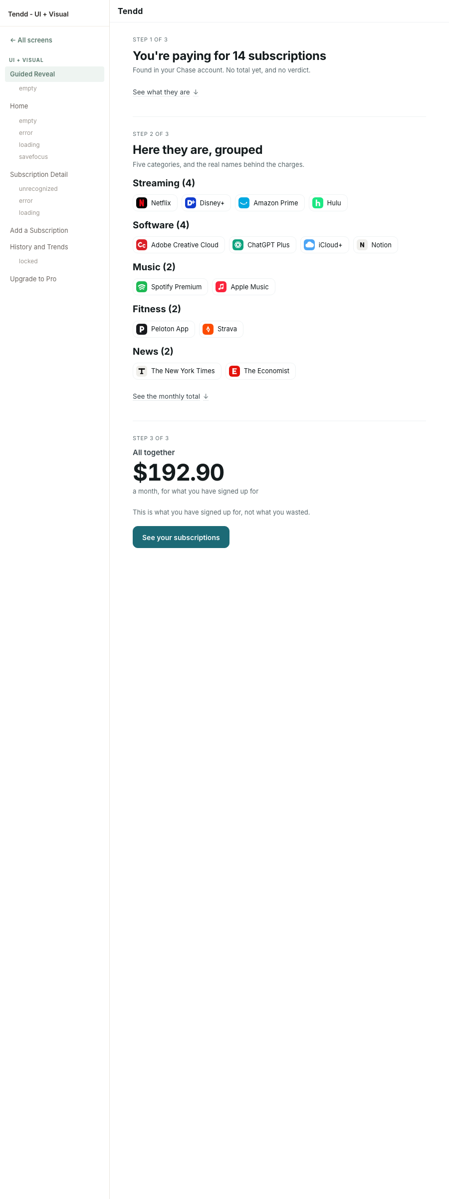
h2 and here the head is an h3. The loudest thing on the calmest screen in the product was the word "Streaming".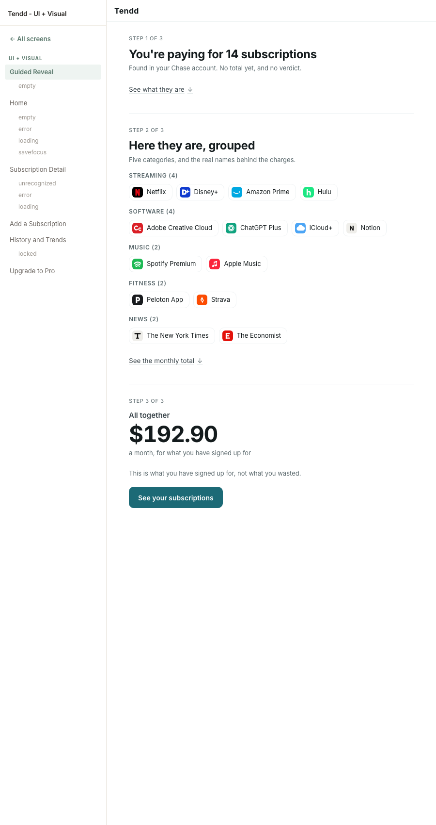
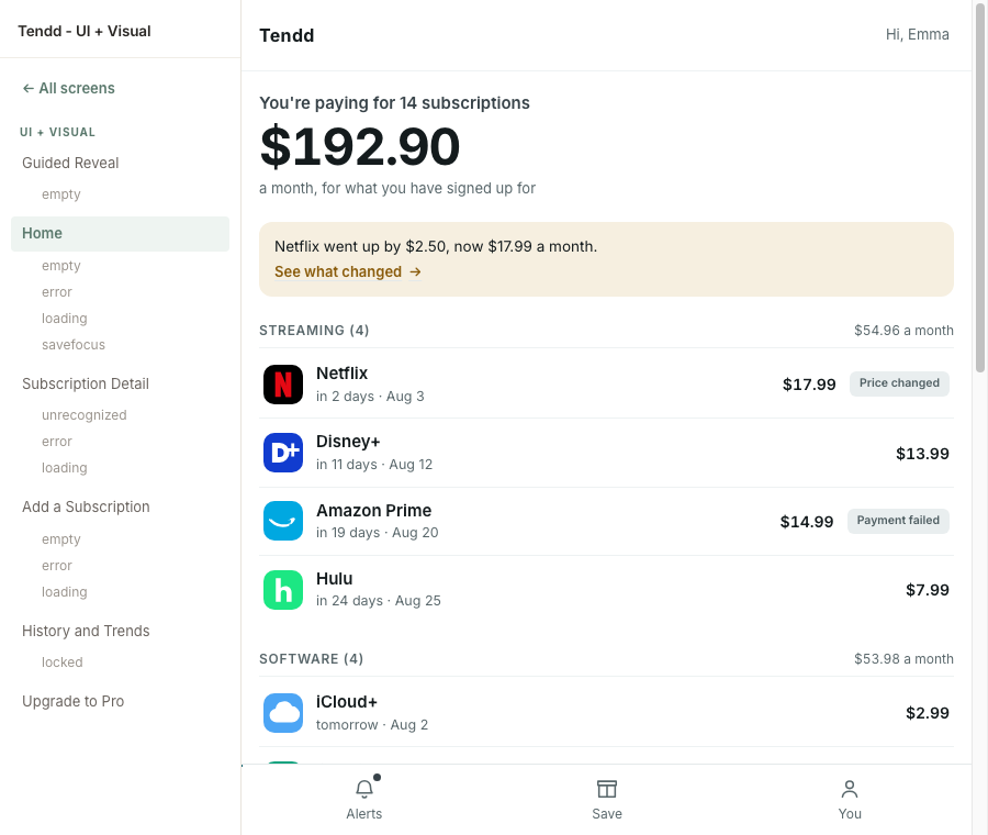
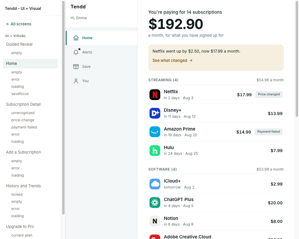
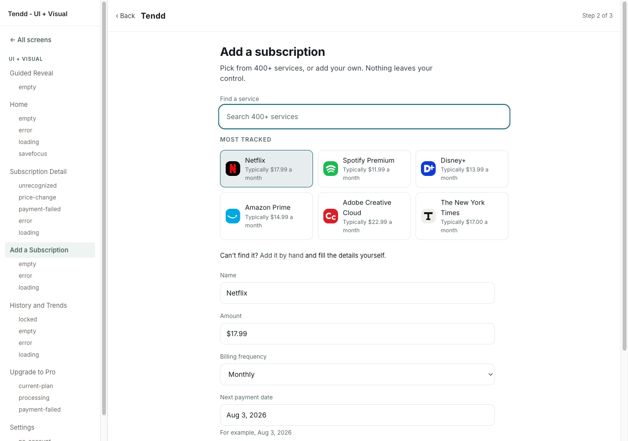
--line at 1.23:1 on paper. On a good screen in a quiet room it reads as calm restraint. WCAG 1.4.11 asks 3:1 of the edge that identifies a control, and this is the edge that says a field is a field.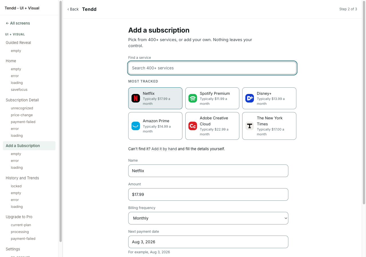
--line-control #7b8d91, at 3.46 on paper, and only on controls. The founder's call was the scope, not the number: raising --line itself would have satisfied any checker and outlined every card, panel and callout in the product, which is exactly what the language was chosen against.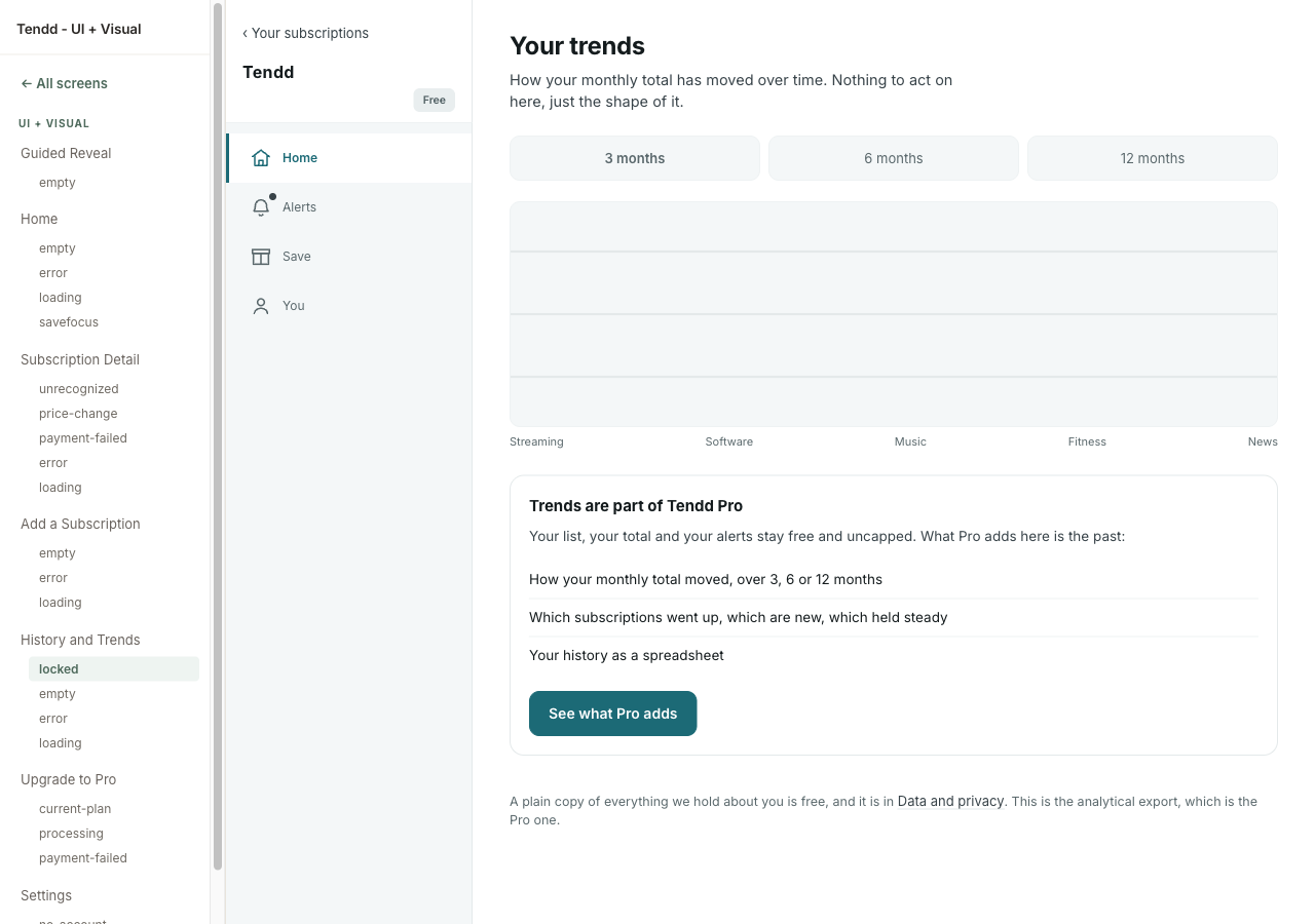
> .screen > so a blanket reset written for another screen's layout cannot outrank it. No value moved: 560 was always the number, it had just stopped being applied past a 900px container.